


An app design for those wanting to purchase second-hand clothing, without the stress of unreliability.
VeriFASHION is a dependable application with a seamless verification process of reviewers, products, and sellers. Made by people with a passion for fashion, for the people who want verifiably stylish new items in their wardrobe!


Exploring the e-shopping landscape

Online shopping is something I personally partake in (probably more often than I’d like to admit!). Receiving the brief for an individual project, I knew I wanted to tackle the existing issues of online shopping, in an attempt to provide suggestions to make the experience more seamless and tailor-made to users.
VeriFASHION takes the guess work out of quality control and management in online second-hand clothes shopping.
Users have a verification and rewards system, so they not only are encouraged themselves to be trustworthy in what they sell and review, but also they can be assured what they are buying is from trusted sellers.
I wanted to focus specifically on the mobile interface, as I personally have had a lot of issues with online shopping apps, they have not translated well from their desktop counterparts and are unintuitive, providing a poor user experience.
The growing popularity of online shopping

Since COVID-19 and the advancement of technology, online shopping has become an increasingly regular and relevant part of people's lives.
One part of the online shopping process is reviews.
Reviews are a significant factor in customers deciding whether to purchase a product. Therefore, it is important for interfaces to have reliable reviews in this climate of scams, misinformation and lack of trust on the internet.


User Research
Survey: 19 participants
I conducted a survey with mostly university students, casual workers and part-time employed workers. The mean age range 18-24.
Interviews: 3 people
I interviewed part-time/casual workers who had an interest in fashion and were regular online/second-hand shoppers. Two of which had particularly strong experience second-hand shopping on sites such as Depop and Etsy (direct competitors)
Refining the problem space
Insight 01

Users need efficient navigation, especially on the home page, to make the experience more seamless
After conducting user research, I utilised affinity diagramming to uncover user’s needs and experiences.
This aided in enhancing clarity to identify key themes, translating qualitative and quantitative data into four tangible insights:
Insight 02
Users need ease of communication with the seller to assure they can trust them
Insight 03
Users need ease of verification their clothing will fit and be of ideal quality
Insight 04
Users need assurance the products and sellers are authentic and pricing matches quality
Problem Statement:
How might we improve the online shopping experience so that users can trust the quality of the product and reliability of the seller?

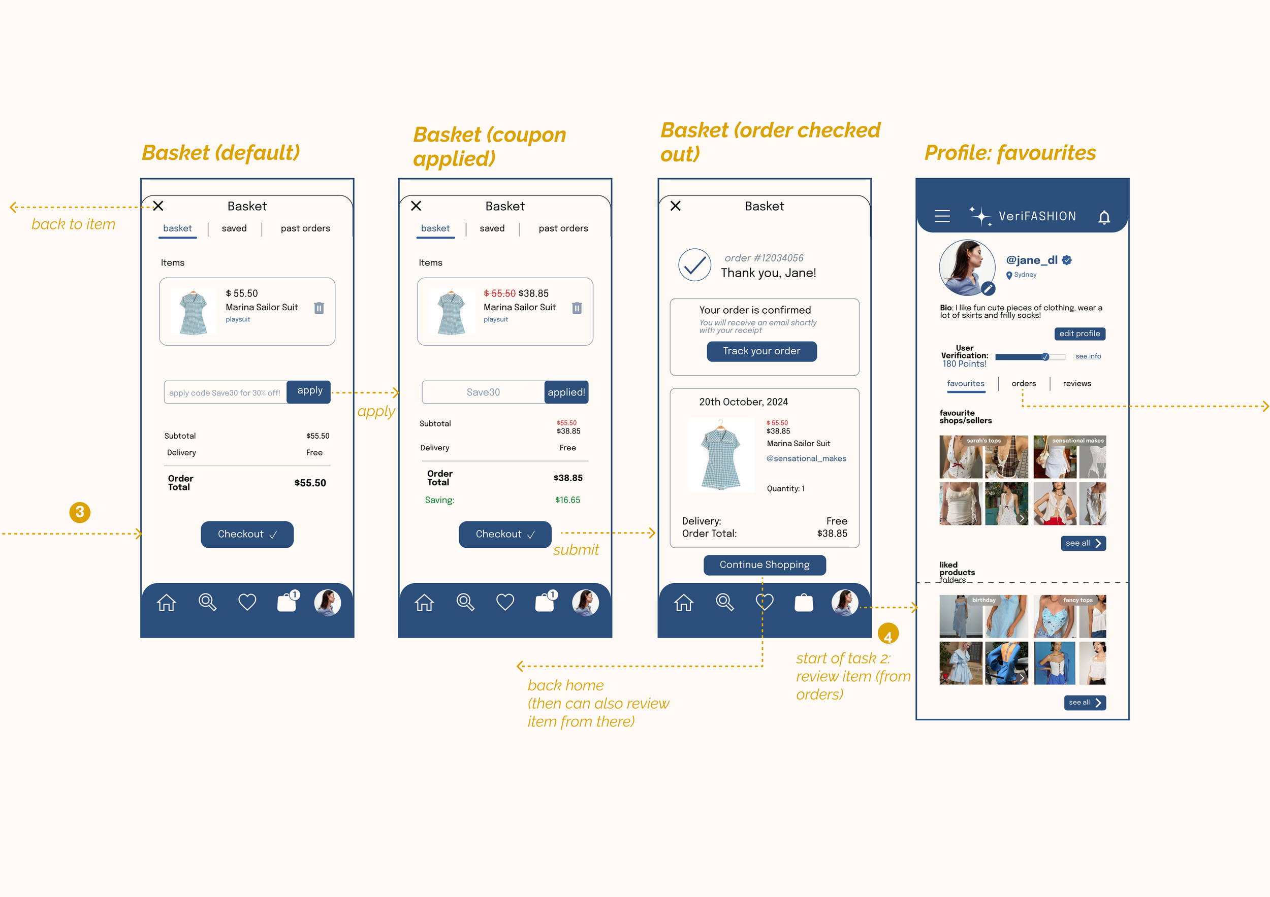
Structuring the User Flow
Structuring the User Flow
Structuring the User Flow
Structuring the User Flow
Structuring the User Flow Structuring the User Flow Structuring the User Flow Structuring the User Flow
In order to satisfy these user insights, I developed the information architecture.
This provided a clear user flow and ensured ease of navigation through the interface


Design Progression
1. Sketches
*
1. Sketches *

2. Wireframes
*
2. Wireframes *

3. Figma refinements
*
initial mockup
*
3. Figma refinements * initial mockup *

Quality Assurance
Usability Testing
At this stage, I had my initial design ready to go, but to ensure it is efficient, easy to learn to use and navigate, and to the user’s satisfaction, I conducted some user testing.
For this I gathered five users, all similar to my target audience → aged 18-24 and regularly shop online (especially for clothing).

moderated, quantitative data
Conducted with 5 users, had them complete 2 tasks. measured time taken, errors made, and success of completing tasks
Task 2 (complete a review after ‘buying’ product:
had the most errors (2)
only 2/5 completed the task successfully

post-experience questionnaire
Here I gained qualitative and quantitative data, providing immediate feedback on the user experience and satisfaction of app & design. I found that:


system usability scale


Doing OK. Still room to improve

I conducted expert testing, with three expert designers. This aided in quickly spotting any design flaws that I may have missed and any usability errors to fix up quickly in time for submitting.
In both the user testing and expert testing, I found some user flow issues, design inconsistencies, and potential accessibility errors. Thanks to analysis of testing, I was able to change the design to be up to standard of Norman’s Design Principles and Nielsen’s Usability Heuristics.
This was an extremely valuable part of this task as, working on this individually, I could easily get tunnel vision and miss certain details. I learnt a lot from fellow designers and through conducting their heuristic evaluations as well. Even though we were working on our own separate projects, it was a great use of collaboration and peer support.
Bringing in the Experts
final refinements and heuristic evaluations


Animated interactions throughout the user journey to make it more engaging !


swipe to give your rating!


be shown your points and watch them accumulate in real time!
The app


Takeaways
how to work with little to go on
This project was on a smaller scale than something like a studio project, especially being something I worked on individually, but I managed to work my way around that. I enjoy user research and my skills from previous projects came in handy. Through this project, I gained more competence to quickly work individually, managing my own schedule and juggling multiple projects to meet each deliverable in time
it’s okay to submit
I found myself wanting to constantly refine the design, re-iterate, improve, and add features throughout each week. Sometimes it is okay to let things go, not become too attached and just submit the assignment. I am still so happy with this result and feel it fits the requirements, I just had to learn how to stop being a perfectionist!
collaboration is important
Although this was an individual task, I still took advantage of any support systems available and felt this helped tremendously. Whether it was through tutor feedback, other designers, or family and friends, it all assisted in avoiding tunnel vision and creating a design that was for the users. I gained more skills in user research and really enjoyed developing a project that puts the customers first, which is at the heart of all my work.
